Poland 25
What are Poland's most coveted destinations? Astonishing natural treasures? What's our culinary landscape like? We look at al…
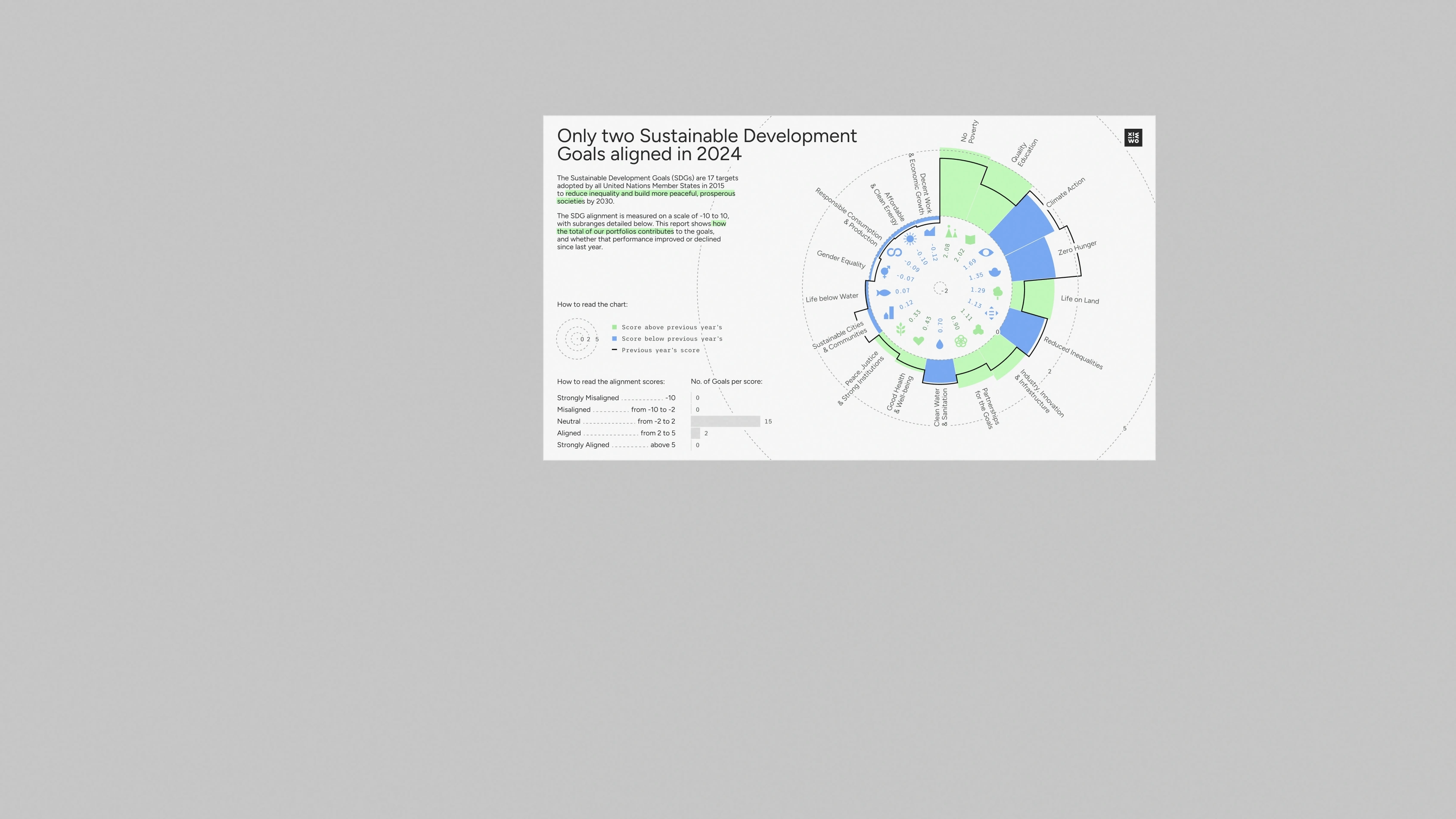
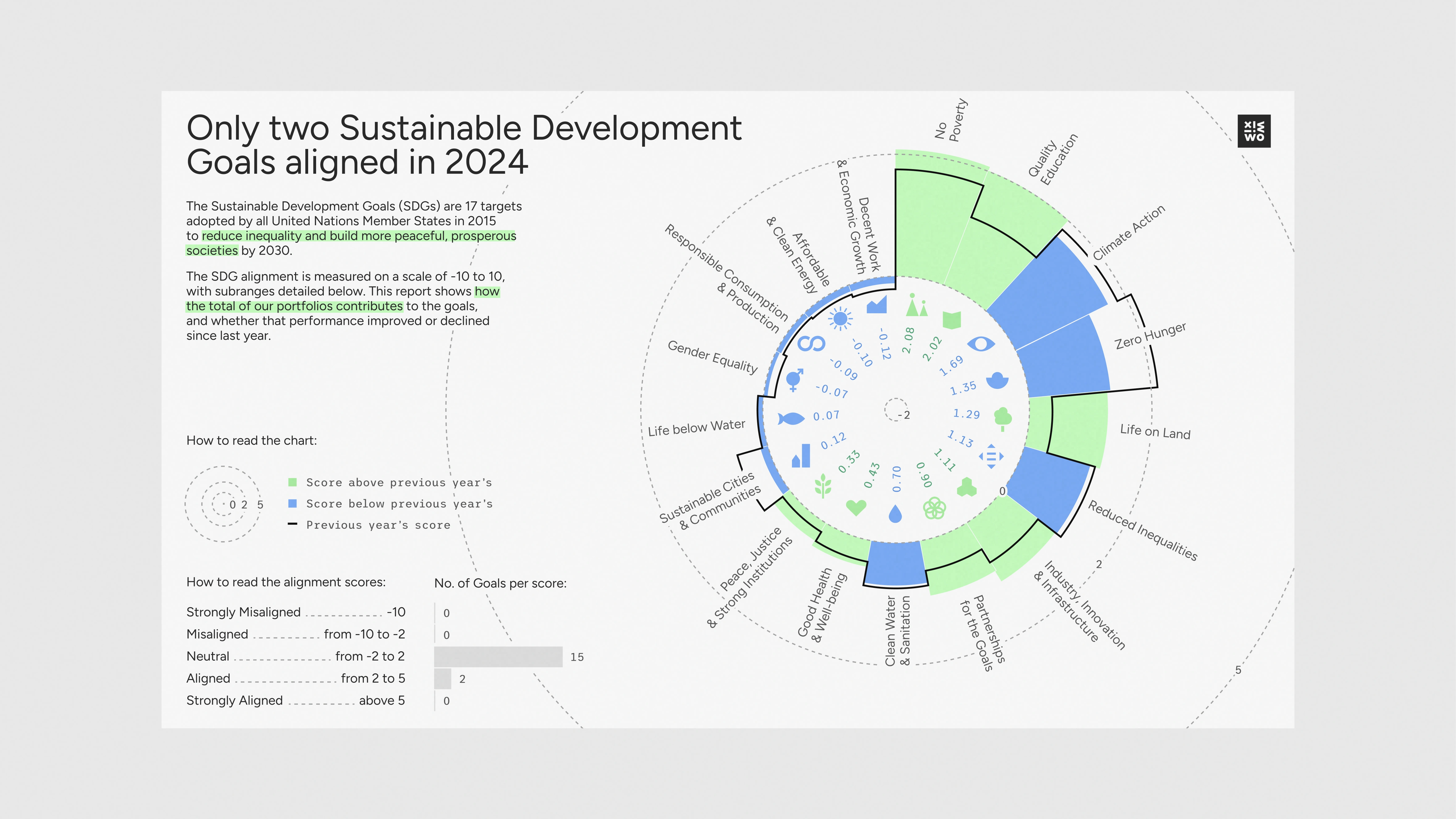
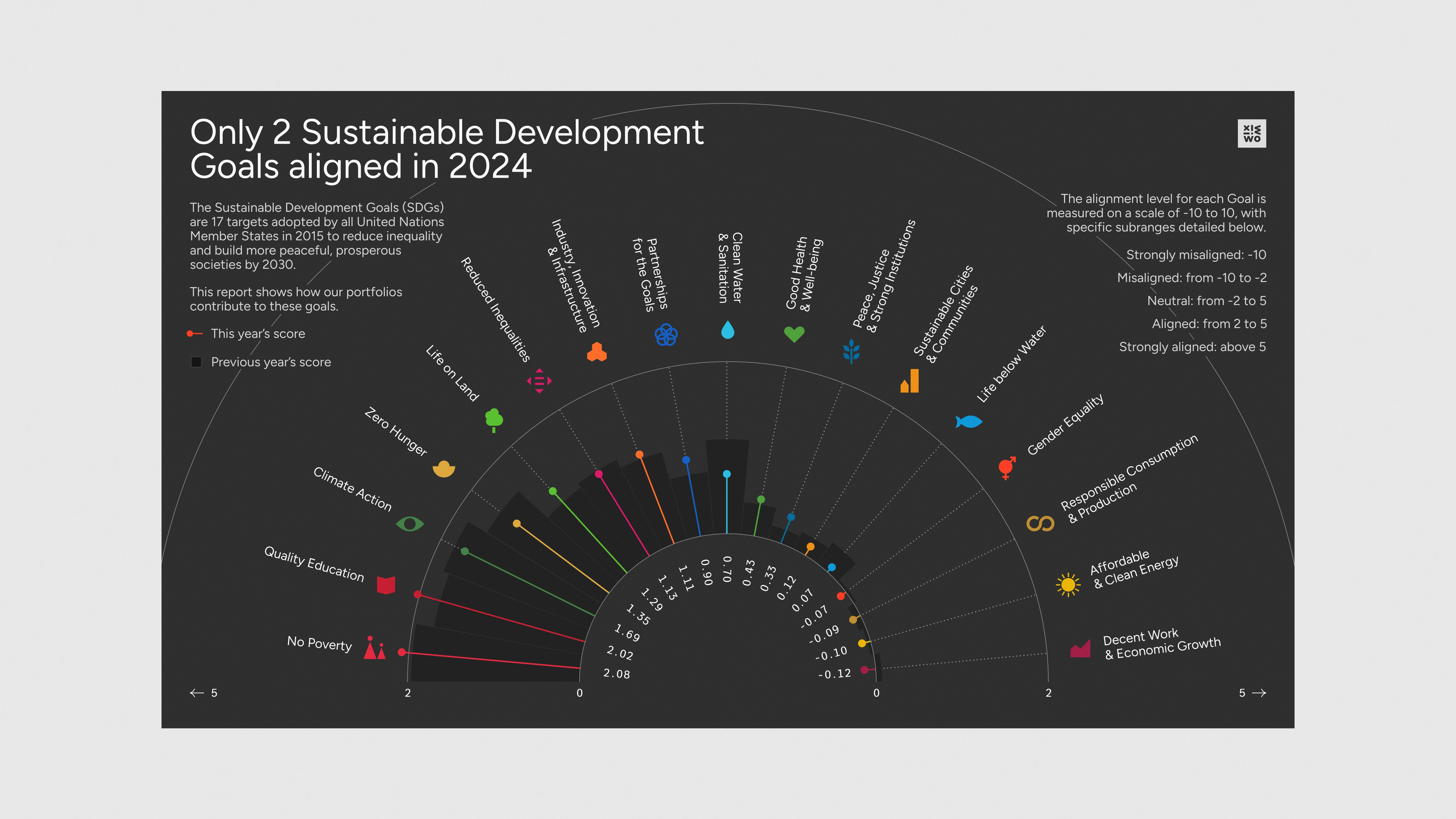
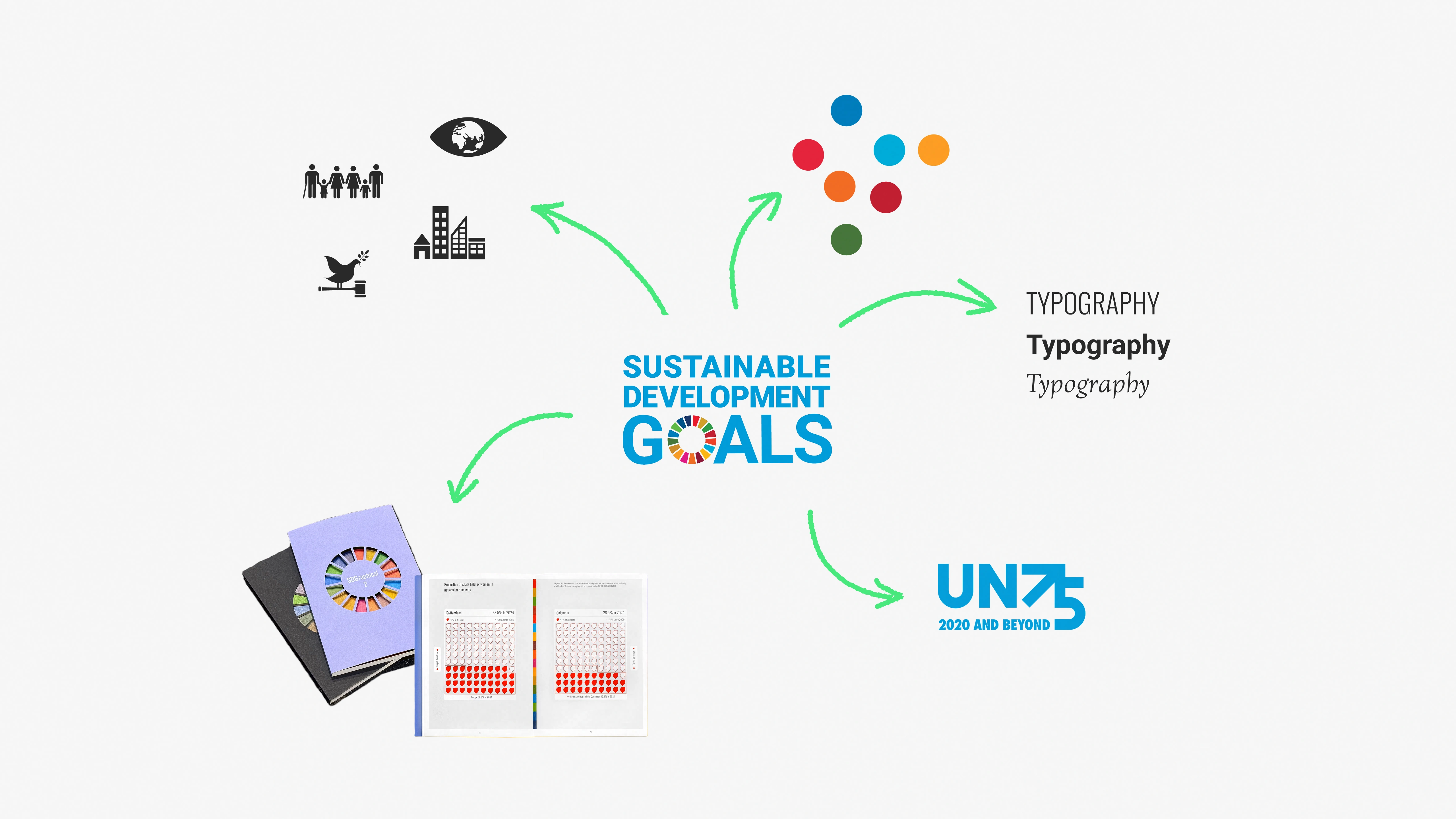
This creative data visualization piece offers a look at one company’s progress towards achieving the United Nations’ Sustainable Development Goals.
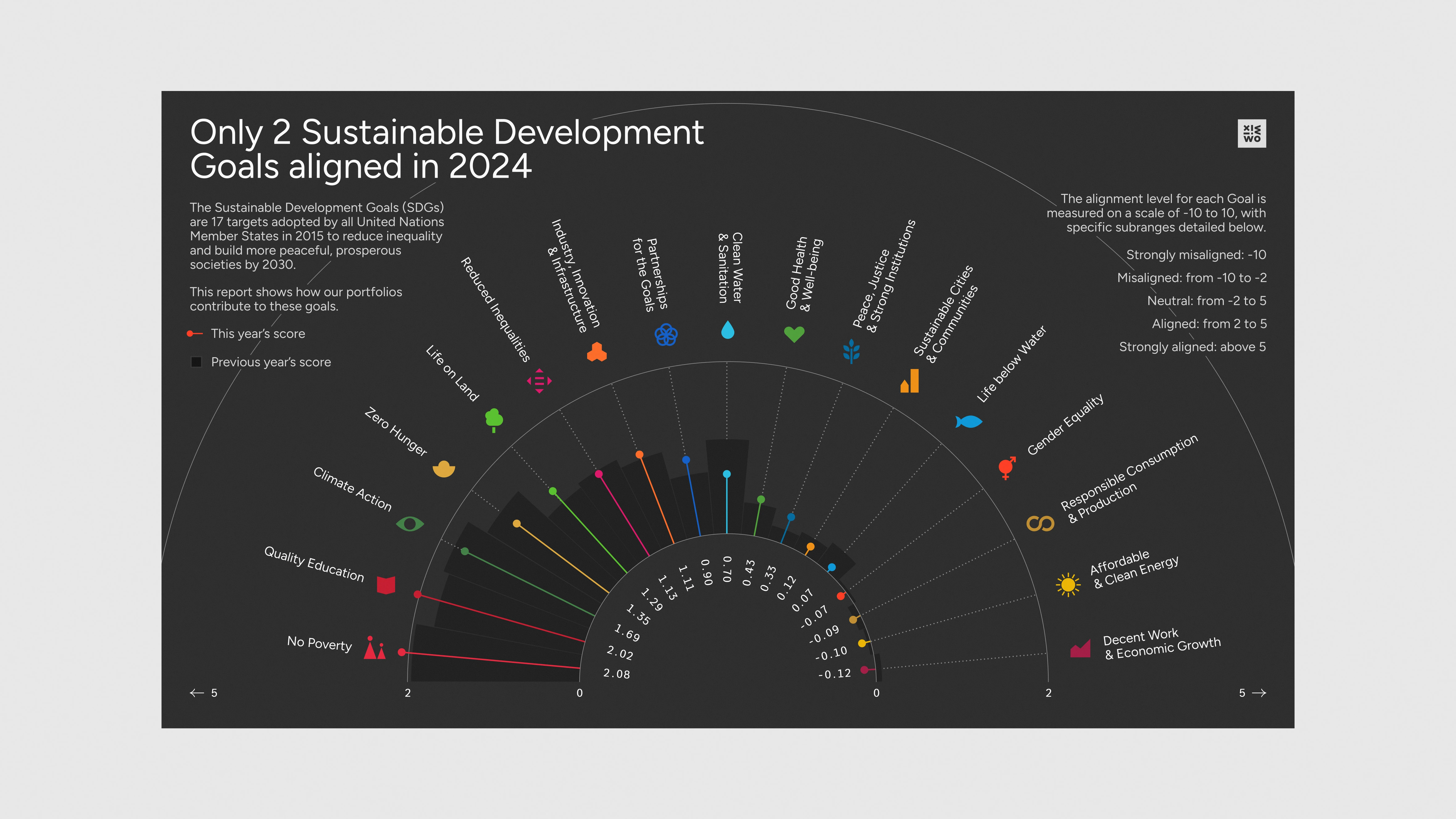
The UN’s Sustainable Development Goals are seventeen interconnected global goals adopted by all UN Member States as a shared blueprint for peace and prosperity by 2030. Working to achieve the Goals means working to end poverty, protect the planet, and ensure well-being for all by balancing economic, social, and environmental needs. Progress towards each Goal can be measured as a score; and the scores fall into buckets from ‘Strongly Misaligned’ to ‘Strongly Aligned’ (the higher the score, the better and more ‘aligned’ it is). Not just countries, but also companies can track their progress towards the Goals – and one such company turned to us for assistance with their internal communication on the subject. We ended up creating a couple of unique pieces as part of the data viz training we were providing.
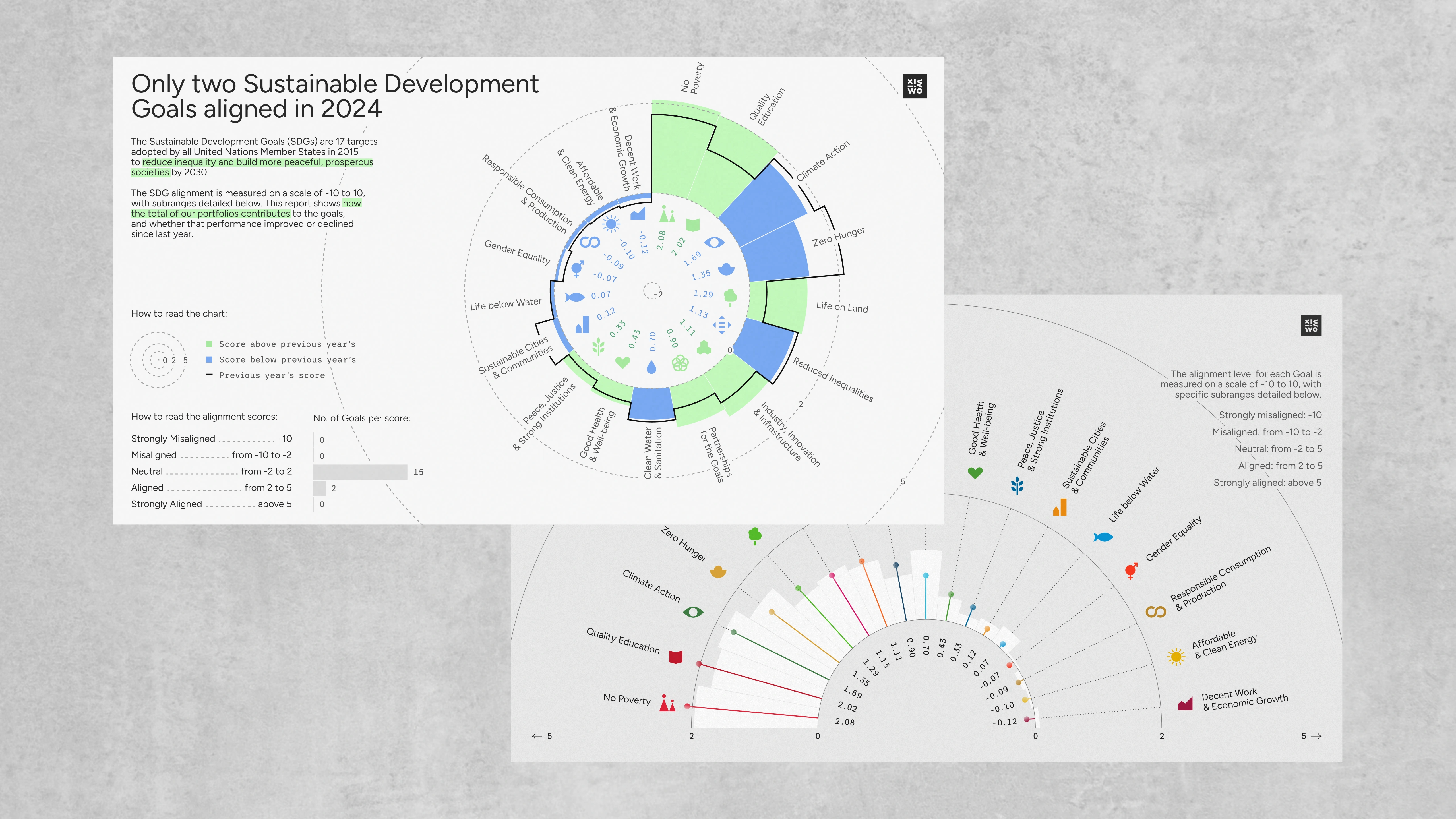
The Sustainable Development Goals have their own branding, distinct from the United Nations. It includes colors, typography, and iconography, and of course, we had to figure out a way of marrying those elements to the visual language of our client (for confidentiality reasons, the client branding has been replaced by our own in the examples shown here).
Since this is a very potent, international subject, there already exist plenty of amazing SDG-related data visualizations (by Superdot Studio, for example) – and we were excited to be able to refer to them. For our own benefit, we put together a simple moodboard with all those visual references.
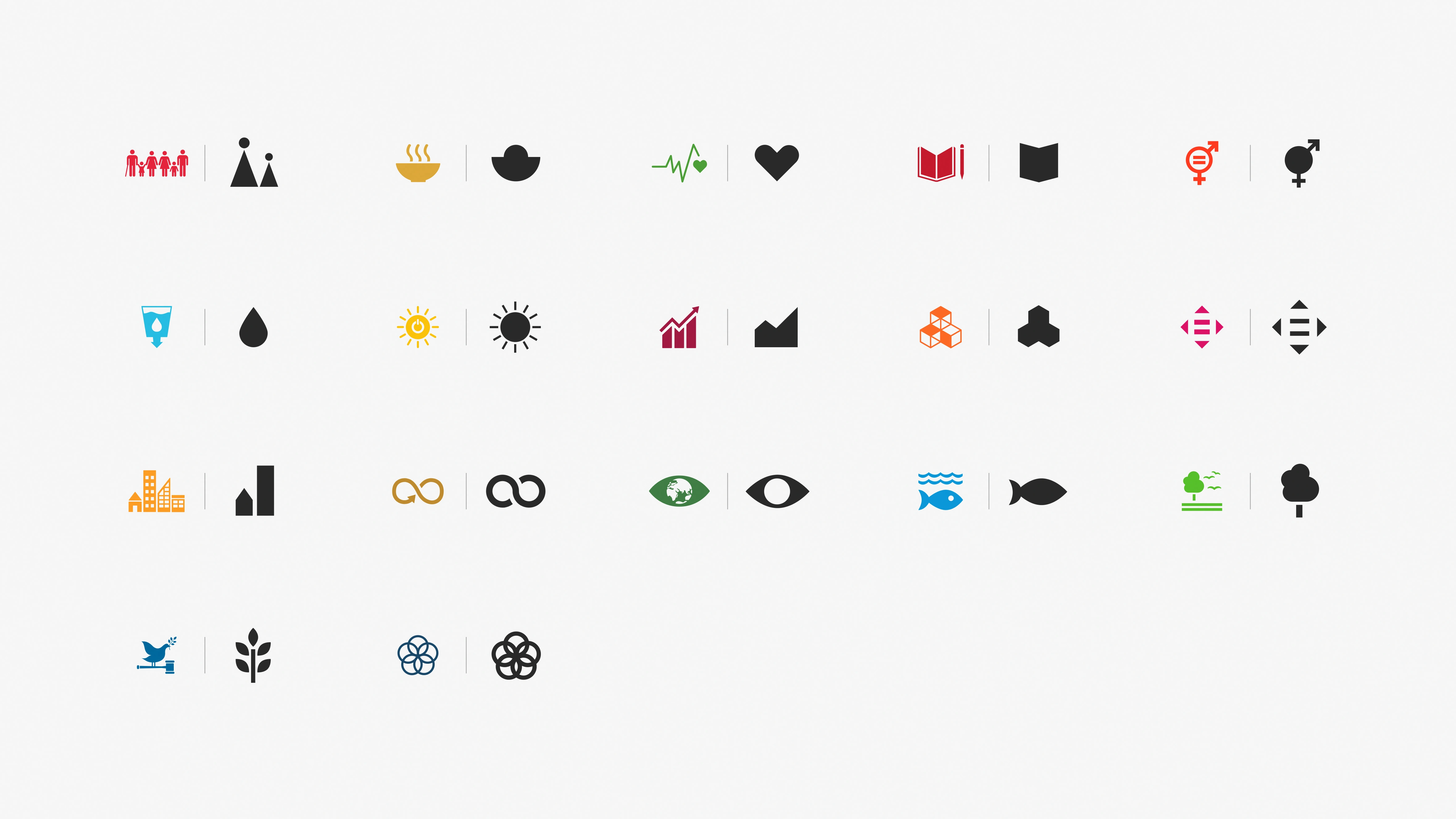
While sticking to the official SDG palette whenever possible and making as few changes as we could, we nevertheless took the liberty of tweaking some of the colors to make sure our final piece would be readable and accessible.
The part that required – in our opinion – the most modifications turned out to be the icon set. To make sure our finished infographic would be clean and scannable, we decided to redesign the icons almost completely. Following in the steps of Superdot Studio, we significantly reduced the complexity of the symbols and adjusted some of their proportions for better scaling and readability.
As we were figuring out how best to show the data, the main challenges that emerged were as follows:
How to accommodate for this a single chart? We’ve eventually crafted two layouts that worked well with those restrictions, and which we also simply found pleasing: one of them being, of course, a circle, and the other – a half-circle. We were especially drawn towards the second one, but we ultimately decided to explore both of these related approaches.
In both of them, we ‘zoomed in’ on the actual scores and only hinted at the existence of higher thresholds, which incidentally created an effect of the infographic reaching beyond the edges of the page.
The reason we liked the second layout is how well it goes with the message of the infographic. The scores are arranged in an arc, which, especially with the bright colors, might make you think of a rainbow – which looks uplifting and is a fitting association for something that you should aspire towards, like fulfilling the Goals. Having refined both layouts, we started experimenting with different color options for both of them.
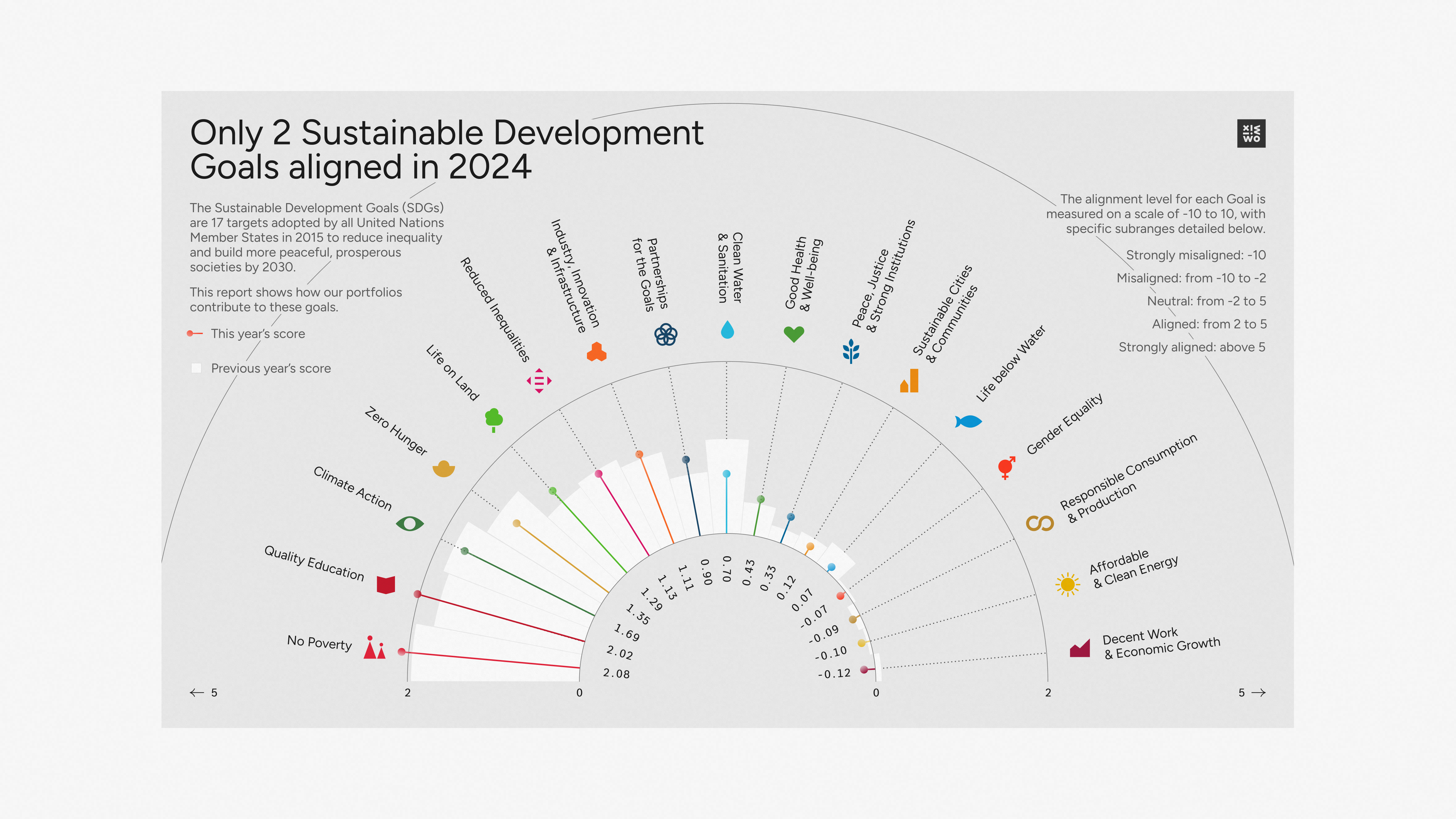

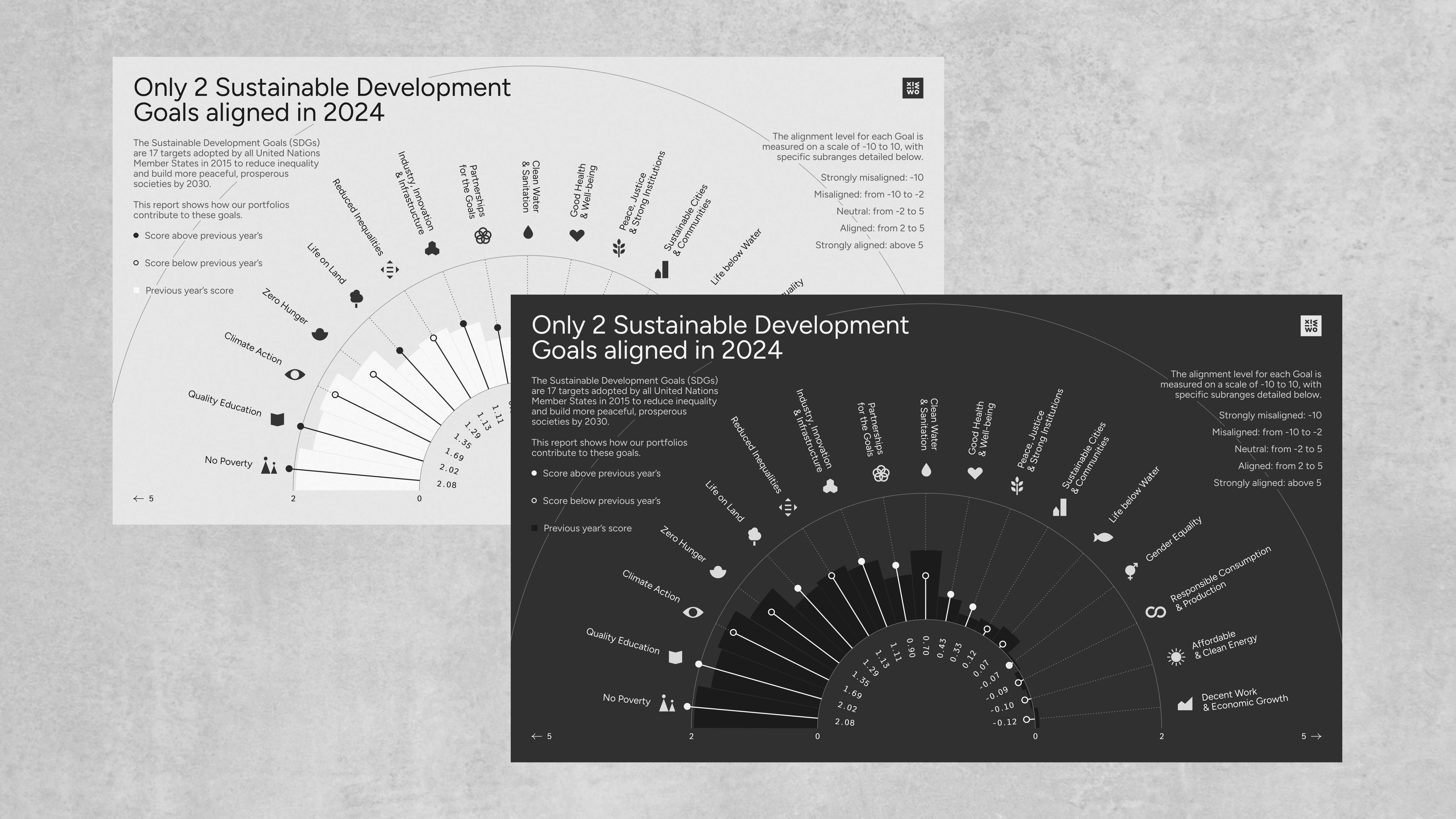
We’ve also explored some black-and-white options, both on light and dark backdrops – noticing how without the colors, the shapes themselves seem to become more prominent. For the full circle option, we’ve only kept the SDG icons, not colors; at least for this one version, we’ve chosen to use color to tell a story with the data. In this case, we’re highlighting the scores that have grown since the previous year in a bright green. The blue used for the other bars is strongly inspired by the official color of the UN.