SDG Infographic
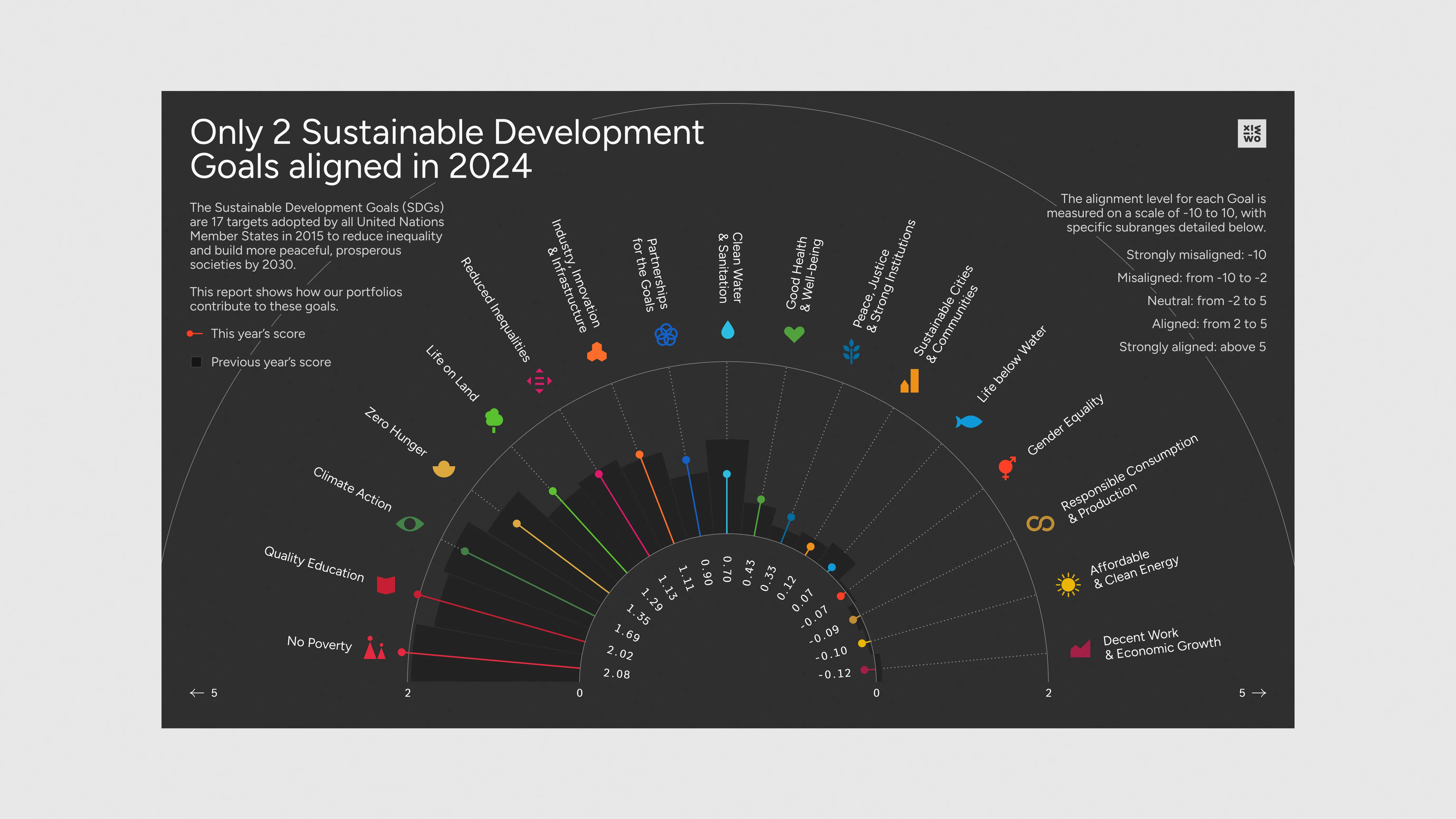
This creative data visualization piece offers a look at one company’s progress towards achieving the United Nations’ Sustaina…
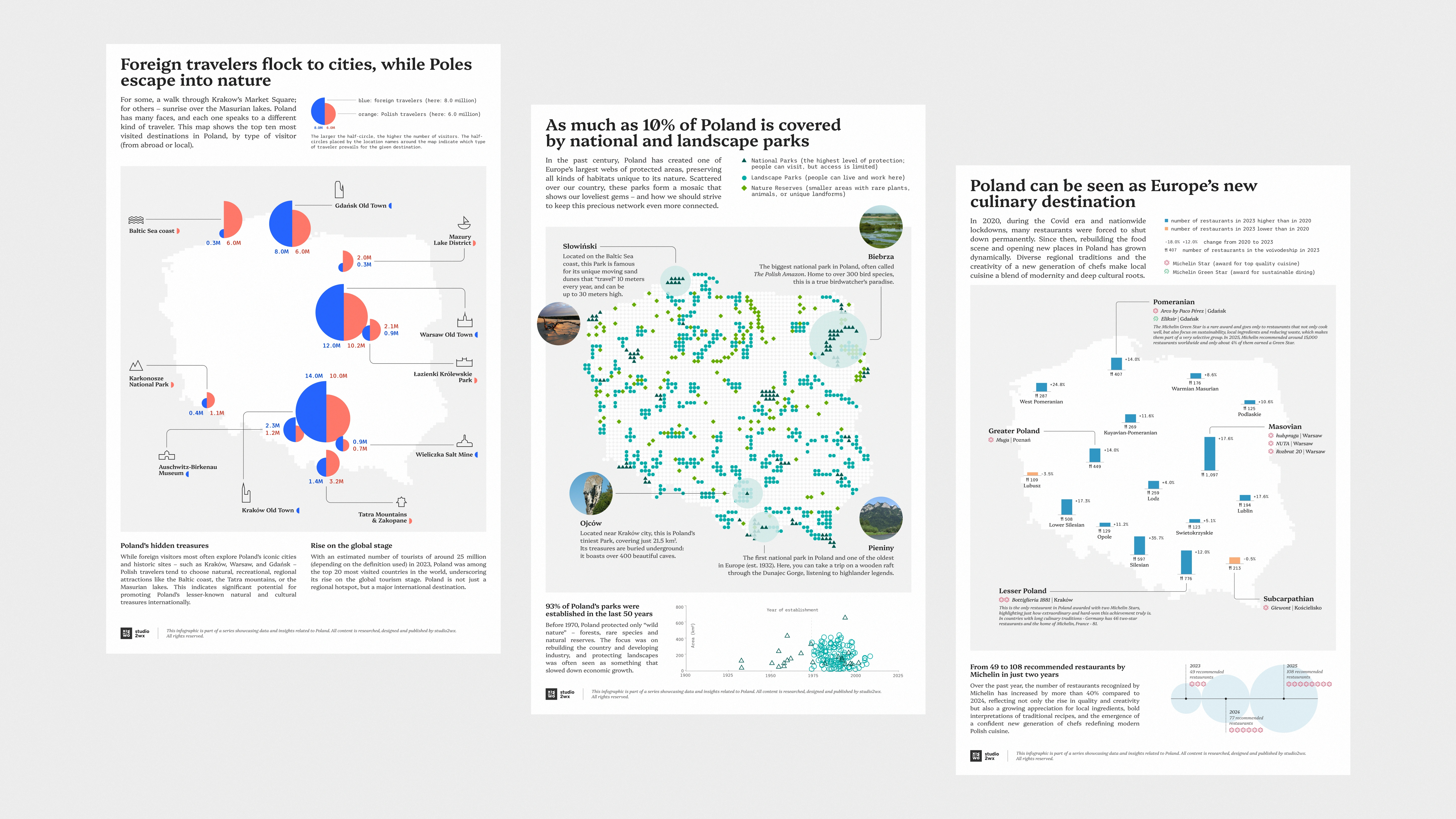
What are Poland's most coveted destinations? Astonishing natural treasures? What's our culinary landscape like? We look at all these questions and more in our series of infographics exploring all kinds of data related to Poland.
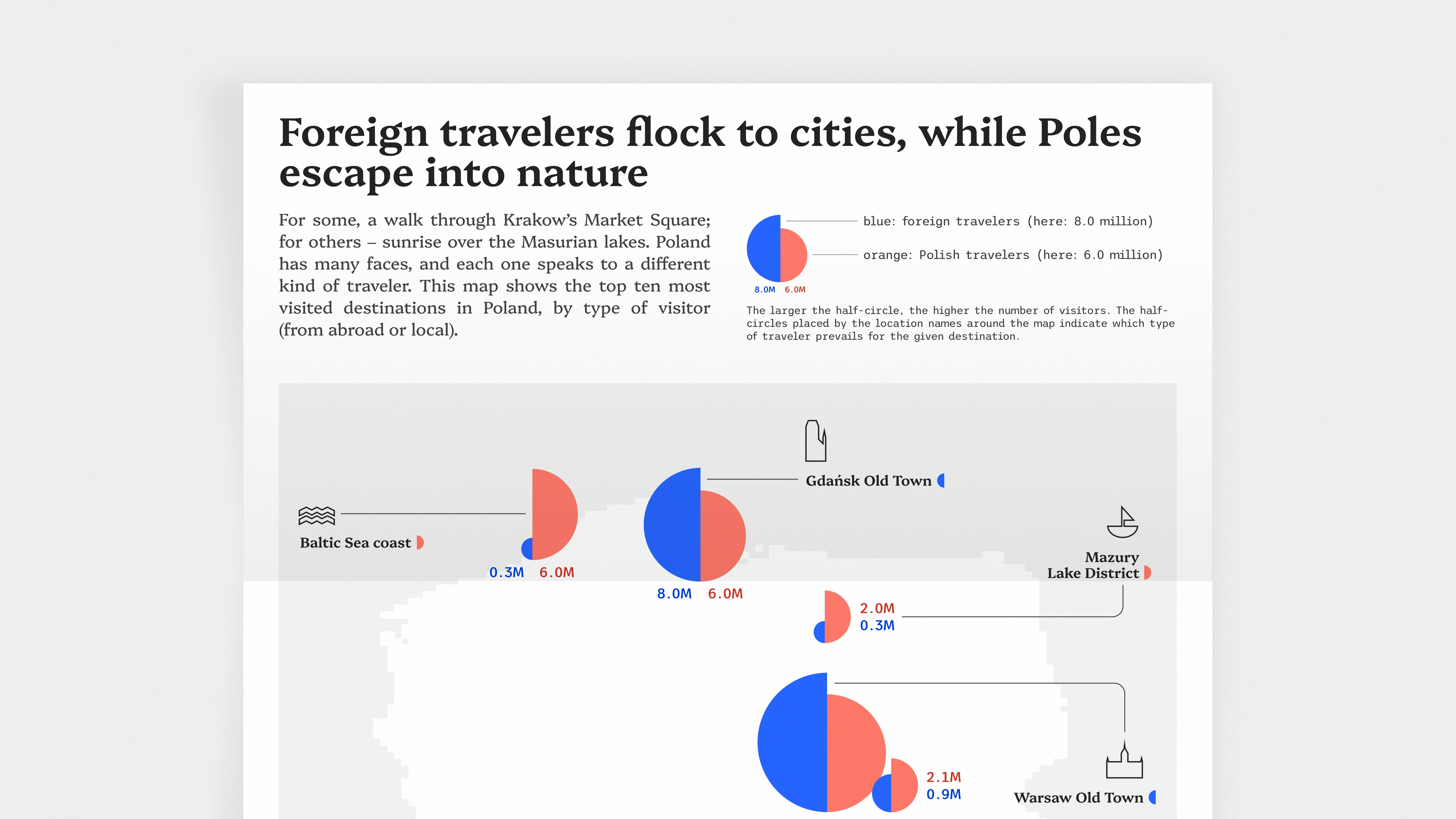
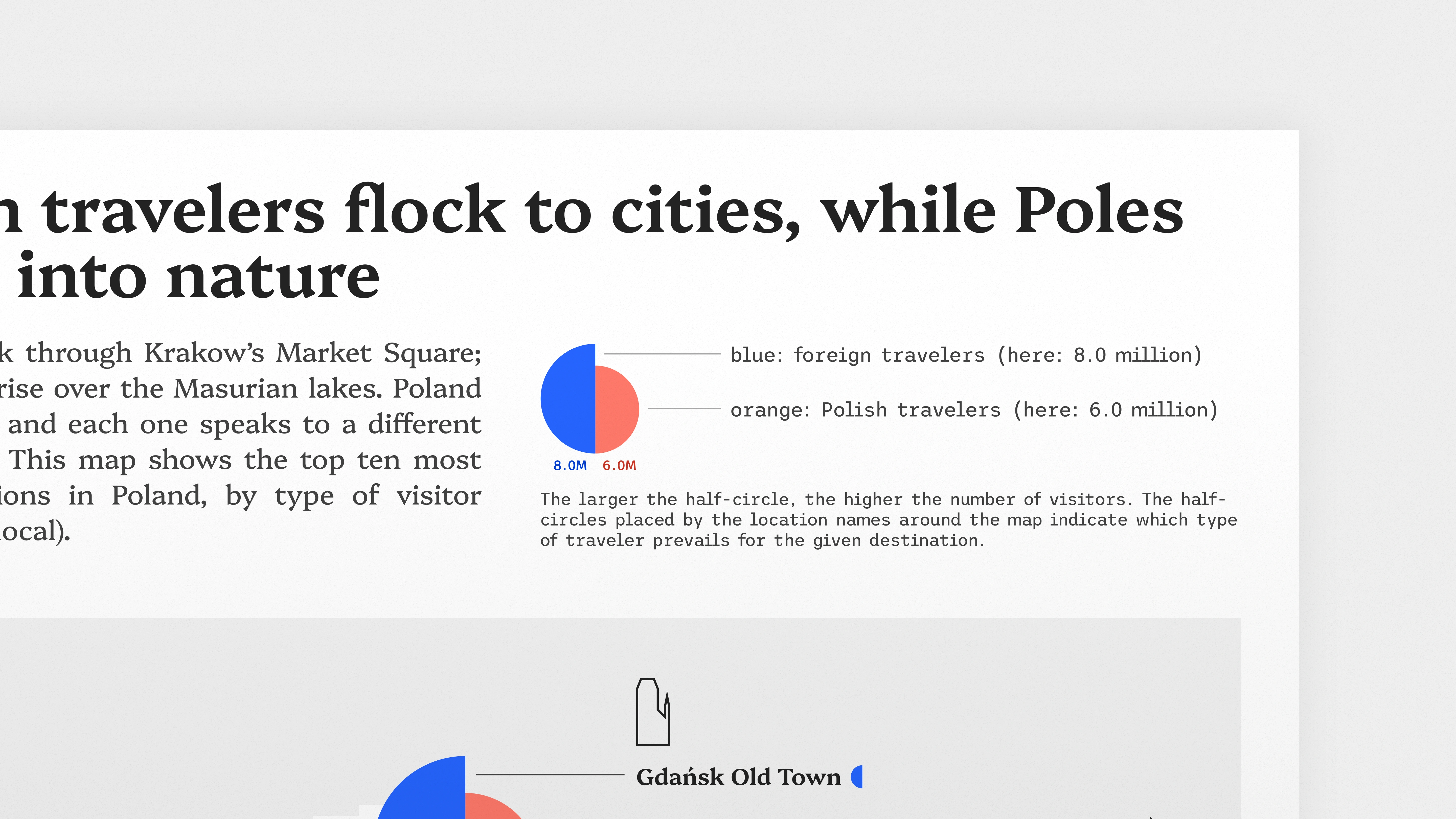
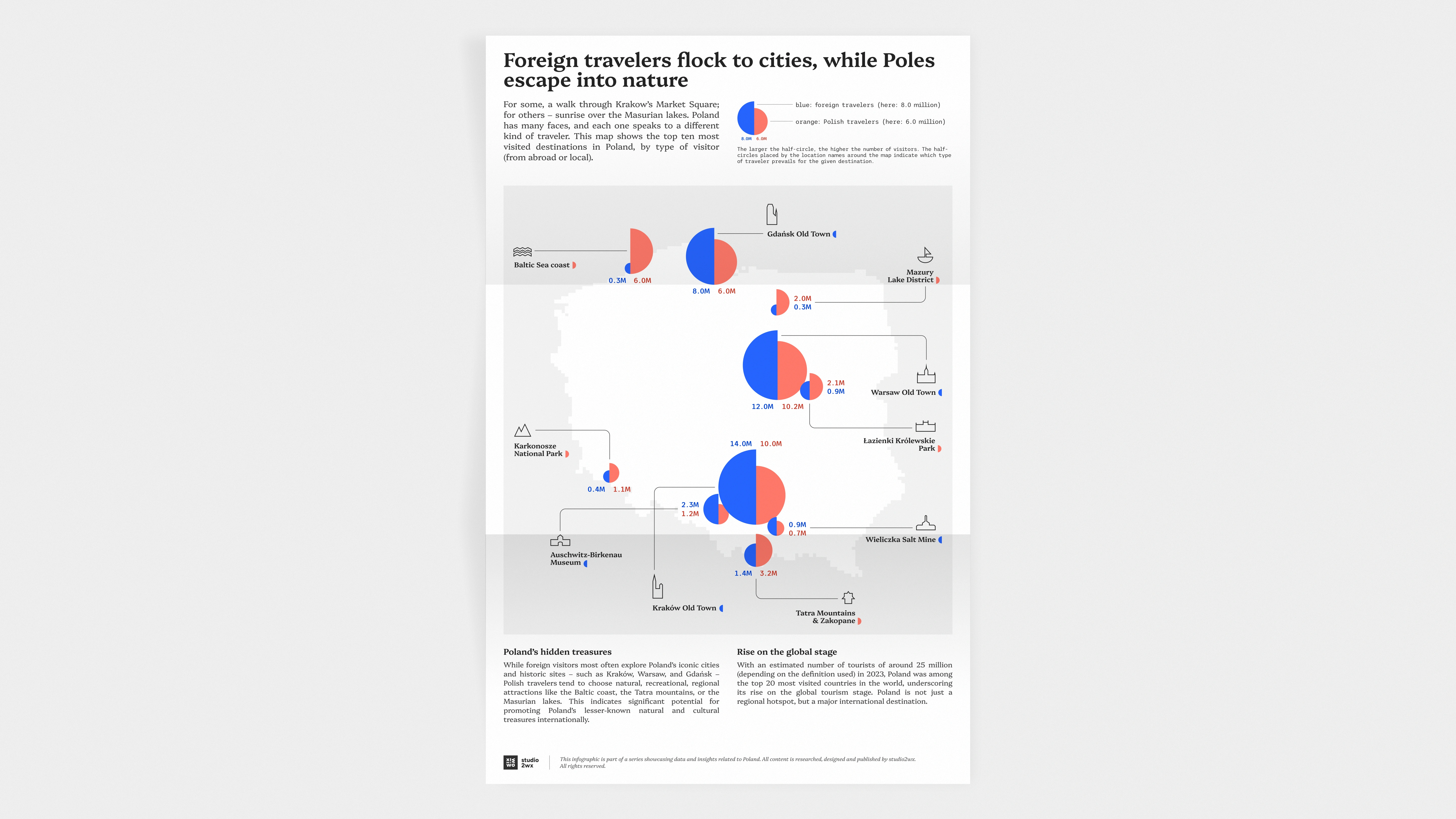
For our first design, we’re taking a look at the most visited destinations in our country – and checking if they’re more popular with Polish or foreign travelers.
We’ve decided to showcase the split very prominently, by placing two contrasting colors right next to each other in each visualization. The charts themselves, though unconventional, were proven clear and intuitive during testing. Each featured location is also represented by a custom icon: a chosen landmark (like St. Mary’s Church in Gdańsk) or a broader symbol (a sailboat for Mazury, mountain peaks for Karkonosze).
This first map, in its many iterations, is the one we used to set the direction and develop a consistent visual language for the entire infographic series. We aimed for the project to feel modern and analytical, while loosely referencing elements of Polish folklore – which tend to look more bright and friendly.
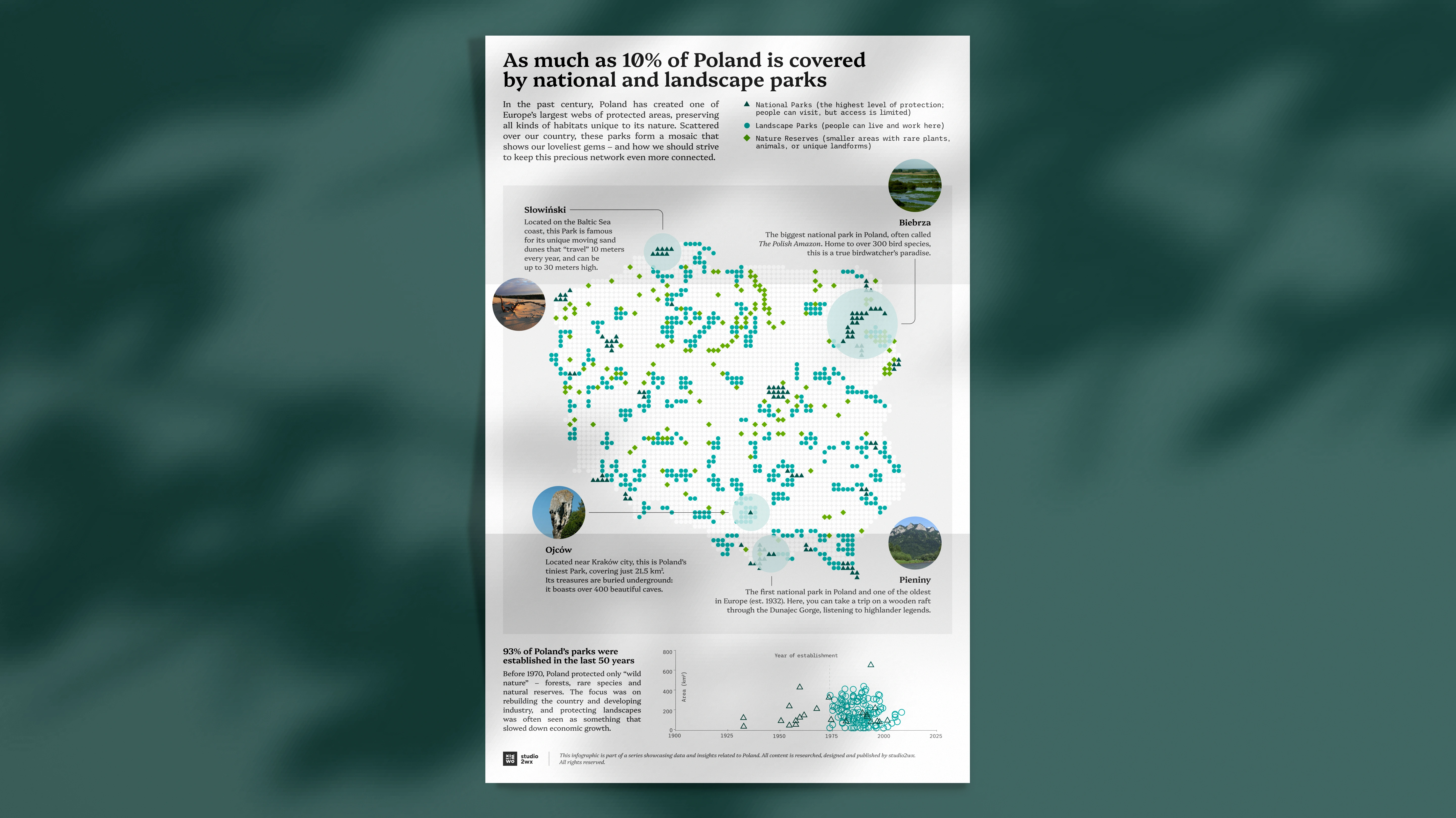
Poland boasts one of the largest networks of protected natural areas in Europe, covering a truly astonishing variety of landscapes: from woodlands and marshes, to caves and even sand dunes. Our second infographic is a visual story about the uniqueness of Polish nature, and how it became so thoroughly protected. To mark the three types of protected areas that we have in Poland (National Parks, Landscape Parks, and Nature Reserves), we opted, of course, for shades of green – choosing them carefully, so that they are still easily distinguishable at a glance. The same symbols and colors are applied in the additional scatter plot, which is placed below the map and provides some historical context.
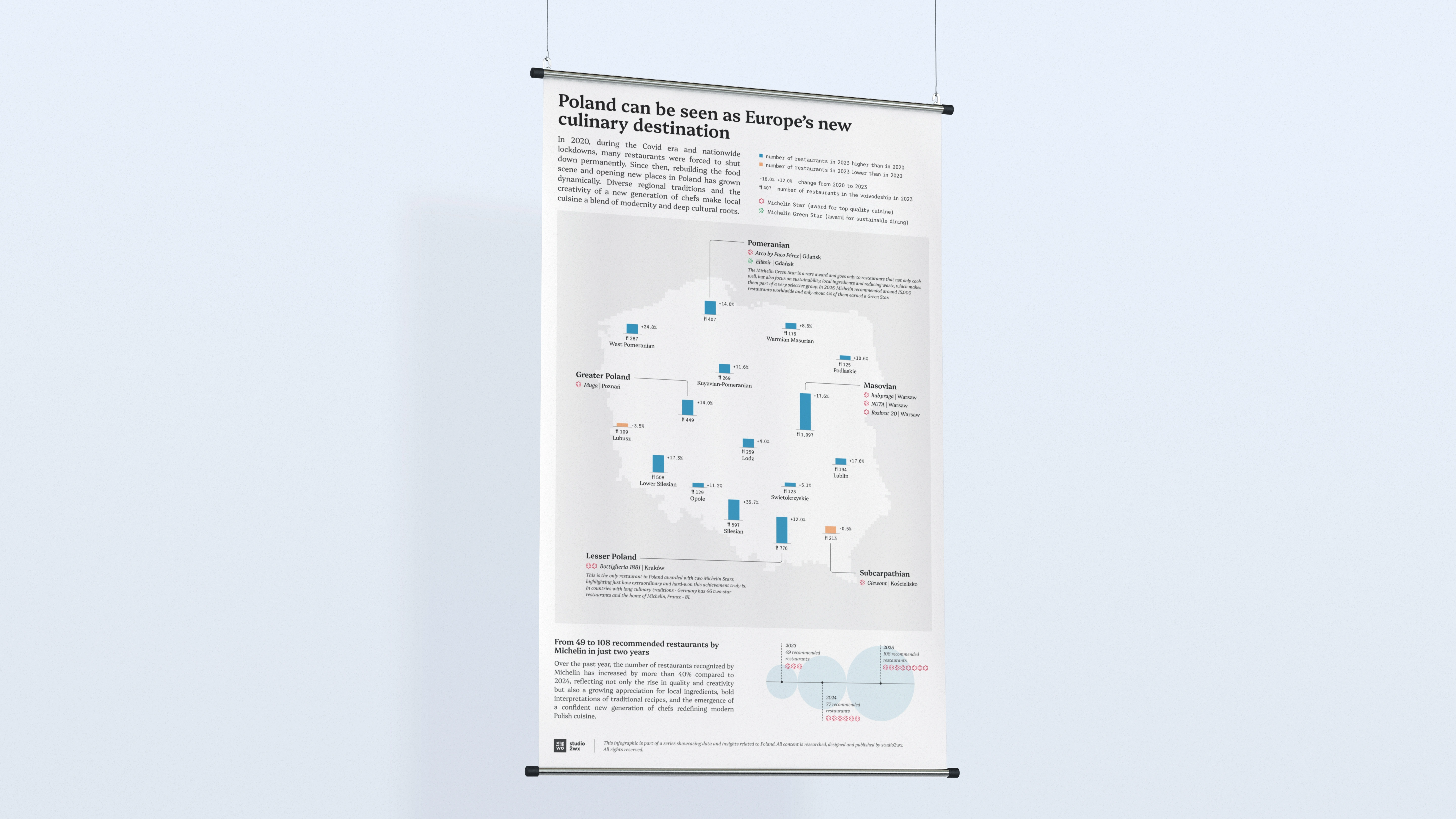
Even though the pandemic forced many restaurants to close their doors forever, what happened next in Poland looks very promising for the future of our cuisine. Between 2020 and 2023, fourteen out of all sixteen voivodeships in Poland experienced a growth in their number of restaurants. But quantity is not the only thing that matters and not the only thing that grew; the quality of our food improved as well.
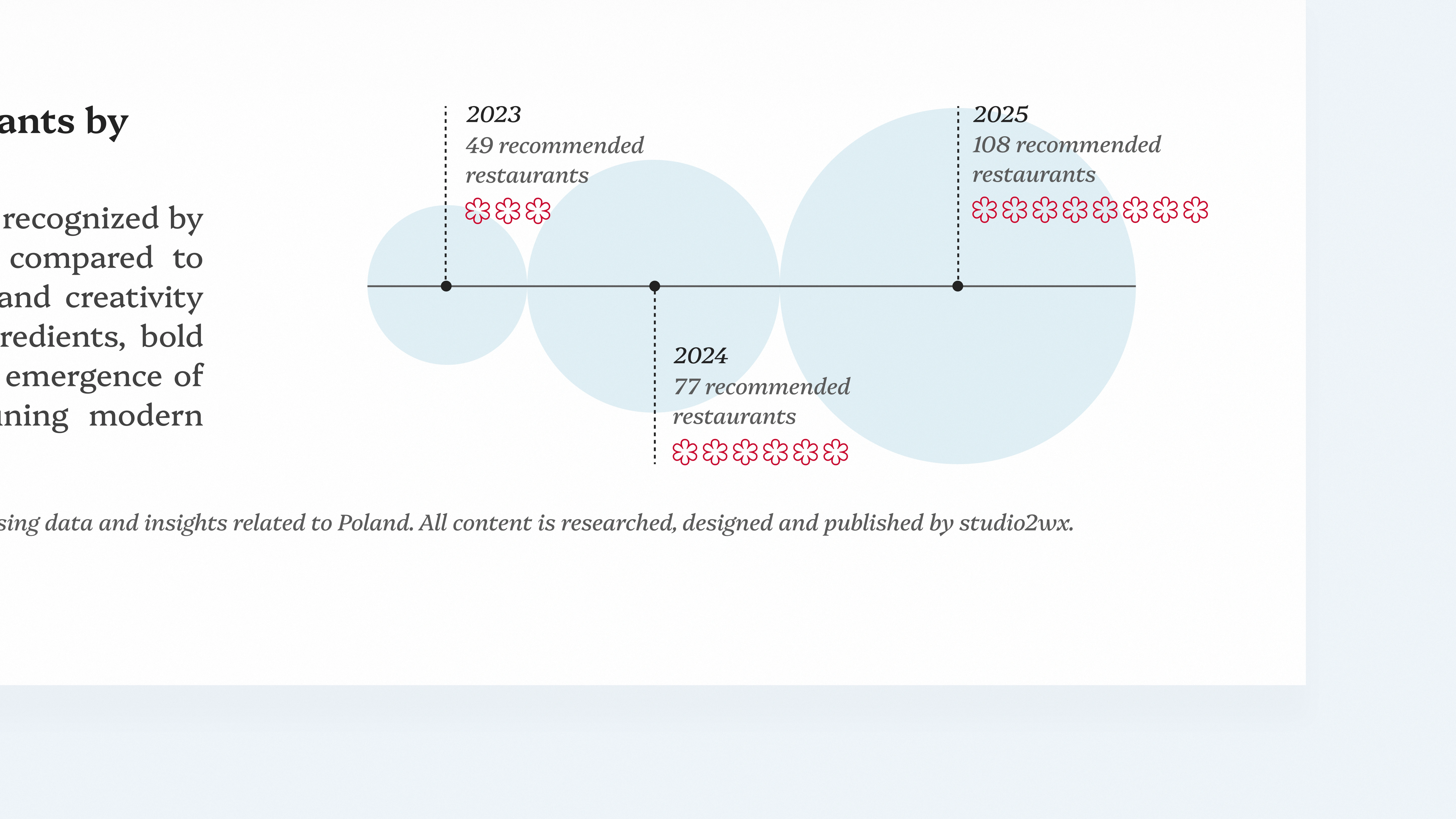
In just two years that followed (2023-2025), our country more than doubled its number of eateries recommended by Michelin. One restaurant – in Gdańsk – can even boast a rare Green Star, which was awarded to only 4% of all the locations recognized last year. A Green Star signifies cooking that is not only on an exceptional level, but is also extremely sustainability-oriented (for example, using local ingredients).
Green spaces in cities support our wellbeing – but are all of them equal in that respect?
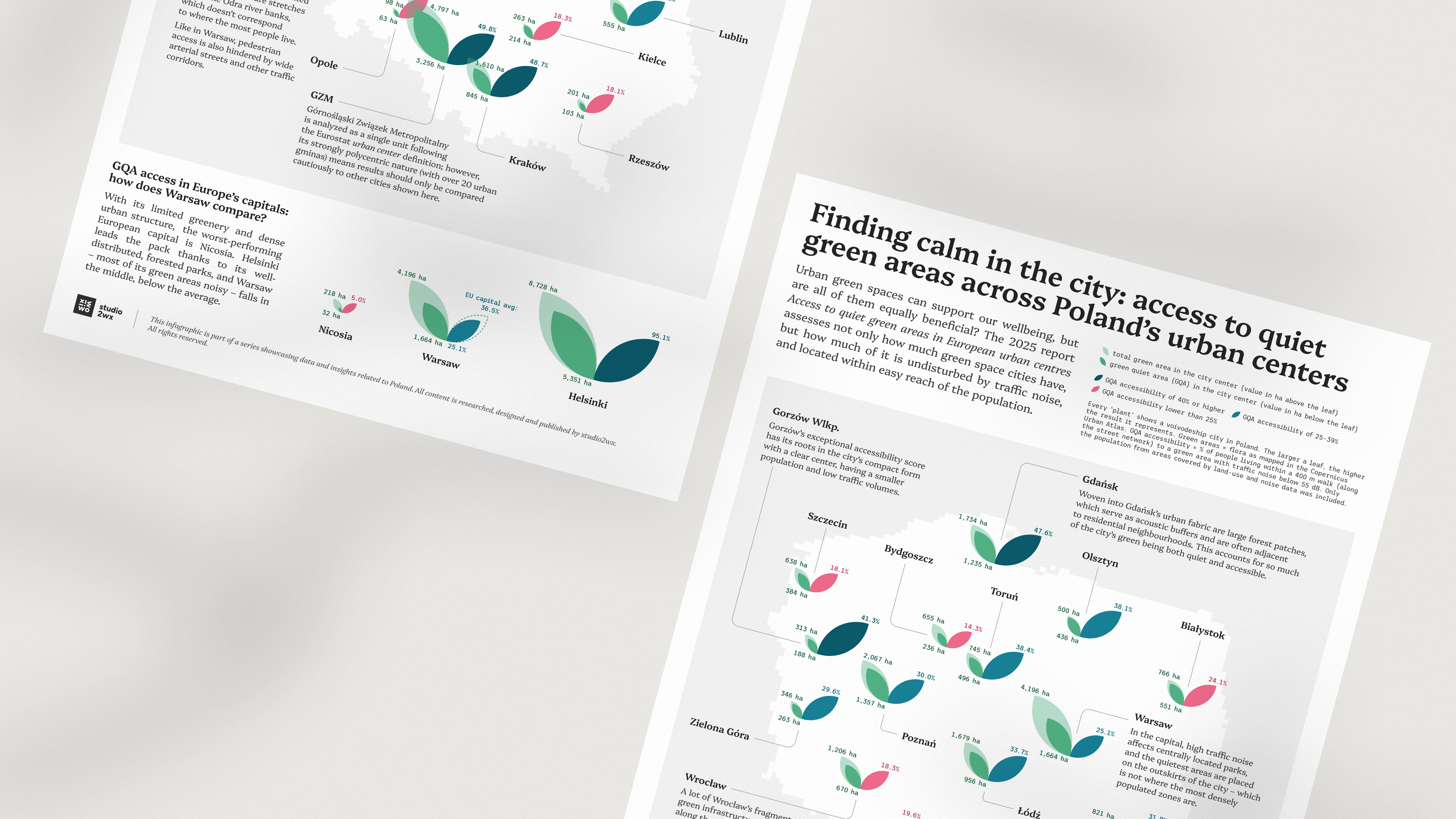
As it turns out, the overall size of a city’s green area doesn’t necessarily go hand in hand with its usefulness to the inhabitants. In many cases, parks and woods are situated far from residential neighborhoods, or get impacted by traffic noise. The report we used as the source for this infographic – “Access to quiet green areas in European urban centres” – takes into account both these factors, not just the green area coverage.
Visually, we of course wanted to come up with a way to somehow invoke plant life, but also the duality of considering the green area size on the one hand, and its actual accessibility on the other. The color scale applied to the accessibility ratings additionally highlights the lowest scores, but the reddish hue is also fitting for younger, smaller leaves.
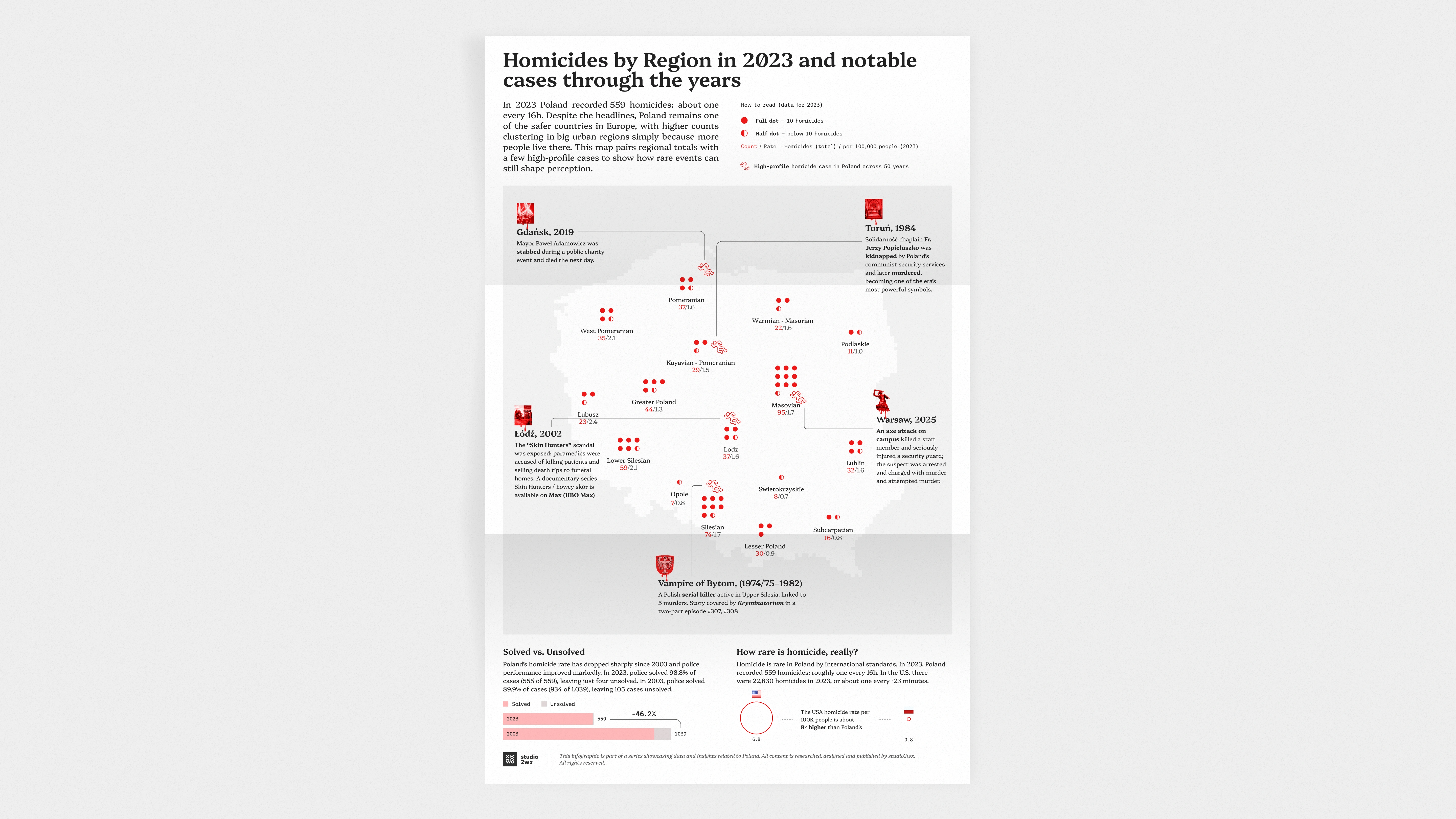
For this piece, we decided to explore a topic that is both sensitive and often misrepresented: homicide.
This infographic looks at homicides across Poland, combining regional data with a handful of high-profile cases that have shaped public perception over the years. The contrast is striking: while individual events stay in collective memory, the broader data tells a story of low rates and a long-term downward trend. The contrast is striking: while individual events stay in collective memory, the broader data tells a story of low rates and a long-term downward trend.
As with the rest of the series, the goal was not only to present the data, but to provide context – helping the viewer better understand both the scale of the phenomenon and the narratives that surround it.